If you are the type of person that likes to have everything done way in advance, I’m not sure if we can be friends…or at least not crafting buddies. 😉 Funny thing is that I started this sign back when I made my Trick-Or-Treat Sign for Halloween. But, I just finished it…two days before Thanksgiving. I guess it’s ok though, I mean, a reminder to ‘give thanks’ will be good for at least a few more days after Thanksgiving. And, I’m a half full kinda girl, so I’m just going to think of this as being waaay early for next year. 😉
First, I cut two pieces of wood and primed them. That was back when I made the trick-or-treat sign, so refer back to that post for more details. Then I used the burnt orange colored spray paint that I bought for my painted beer bottle project (another Pinterest inspiration might I add) to spray the two pieces of wood.
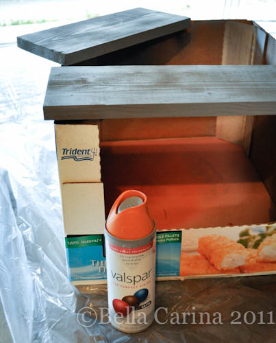 The key is to do light and even coats and keep your hand moving. Lingering too long in one spot will make the spray paint get too thick and create drips…no bueno. See how my first coat of paint still shows some of the grey primer through.
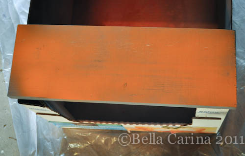 You can spray multiple coats of paint in the same session. Keep applying coats of paint until you are happy with the coverage.
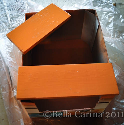 Next, be sure to let it dry thoroughly…or for several weeks if you are like me. Ya, that’s it…I’ve been waiting for the paint to dry this whole time, that’s why I didn’t have this done sooner! Man, oh, man, there’s just really no good excuse. 😉
I wanted the lettering on this sign to be a little more refined and less I-just-went-for-it-with-paint-and-a-brush like my trick-or-treat sign was. That’s when I stumbled across this tutorial on lovely Pinterest. It’s really less of a tutorial and more of just showing a cool method of making letters look nice.
First, I decided on a typeface that I liked. I went with Harrington in size 300. I felt like it was fancy, but still had thick enough lines that I could paint them without too much trouble. Remember to go into the font’s advanced settings to switch it to outline only if you want to save ink.
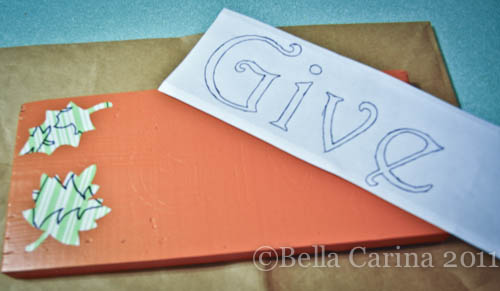
Next, position the word onto the wood. Once you are happy with the positioning, use a ball point pen to trace over the outline of the words. I was sure to push hard since you are trying to make a slight indent in the wood. I found that the paper actually lightly stuck to the wood, so I didn’t need to tape the paper down, but you may need to tape it. This was actually a little trickier than I thought it would be since the grain of the wood would get in the way and send my pen off course slightly. Then again, my wood was not very smooth.
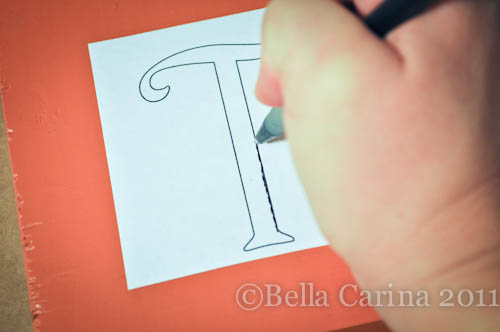 The outline should be just enough for you to see it.
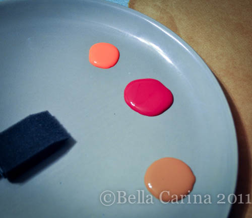
 Here’s my arsenal of paints and supplies that I used for this sign. The brown and red paints were on sale 2 for $1 at Joann. I already had the white and orange at home.
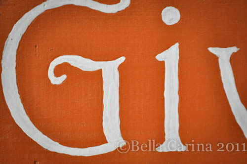
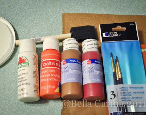 Once the outline was completed, I used a very small paint brush (I bought the $1.99 pack at Jo-Ann which is in the photo above) to fill in the lines using white acrylic paint.
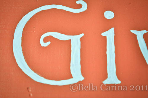
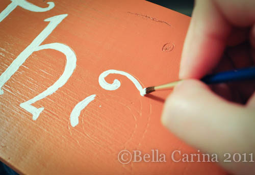 The key was to make sure I had enough paint on the brush and to have a slow and steady hand. I wasn’t too keen on how it looks close up, but from far away, it came out looking pretty nice.
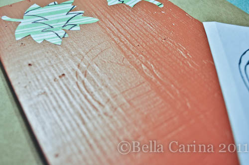
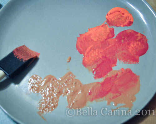
 After I finished the words, I moved on to sponge painting around my reverse stencils. I had some vinyl leaf cutouts left over from my painted beer bottle project. I put a little bit of each of my paints on an old plate we no longer eat off of.
 And then I just started sponging it on, starting in the corner with the brown…
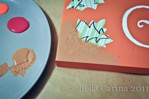 And then slowly started adding little bits of the other colors and adding them around the edges.
 When I was happy with the result I peeled off the vinyl leaves to reveal the reverse stencil design.
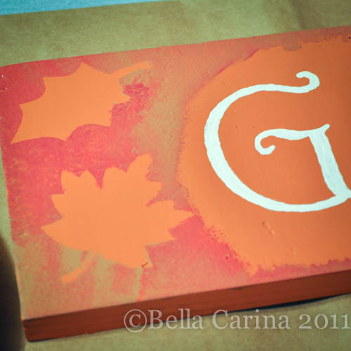 I let the sign dry over night. I decided to make this an indoor sign for now, so I didn’t feel the need to spray it with a clear overcoat, but if you want yours to be able to withstand the elements, be sure to spray or paint a clear poly over your masterpiece.
I decided to place them on the mantel along with my other fall decor. The way the light hits the “Thanks” makes it look like it’s a different color, but it’s not.
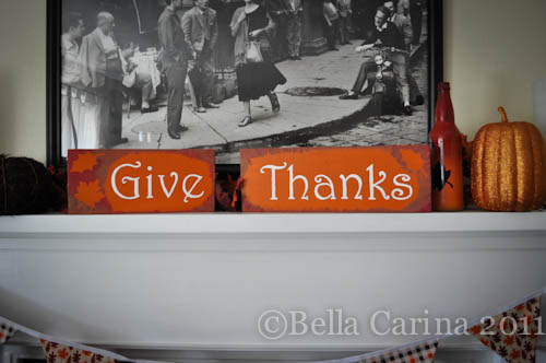 This is a Monet…looks nice from far away, but not quite as pretty up close. 😉
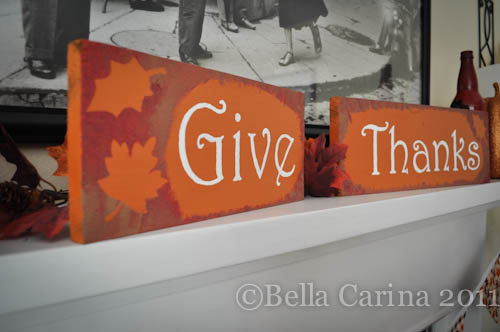 I like how the reverse stencil gives it a little bit of flair.
I thought that the method for painting the letters worked well although the finished product might have looked a little nicer on as smoother surface.
Anyone else have any last minute turkey day projects? I hope everyone had a very happy thanksgiving! I know I have plenty to be thankful for!

